咱就入个门之NHibernate数据库连接配置

旧地址:http://blog.canself.com/nhibernate_conn/

此文仅介绍NHibernate连接数据库配置;有关NHibernate的介绍此处不做详解,具体见NHibernate资料汇总页。

想用NHibernate,首先得连接数据库,下面就看看NHibernate的数据库连接。

关于不同数据库连接的简单配置,其实官方提供了许多【官方包中的Configuration Templates】-学习之初可以使用。

步骤【一般处理】:

1、添加hibernate.cfg.xml;

注:记得修改文件的属性“复制到输出目录”,改为始终复制或较新复制

2、添加文件内容,代码如下:【下为sqlite数据库配置】

1
2
3
4
5
6
7
8
9
10
<?xml version="1.0" encoding="utf-8" ?>
<hibernate-configuration xmlns="urn:nhibernate-configuration-2.2" >

<session-factory name="MySessionFactory">
<property name="connection.driver_class">NHibernate.Driver.SQLite20Driver</property>
<property name="connection.connection_string">Data Source=nhibernate.db;Password=12345678</property>
<property name="dialect">NHibernate.Dialect.SQLiteDialect</property>
</session-factory>

</hibernate-configuration>

3、添加cs代码

1
2
3
ISessionFactory sessionFactory = (new Configuration()).Configure().BuildSessionFactory();
sessionFactory.OpenSession();
sessionFactory.Close();

执行即可【注:sqlite中open不验证密码,此处可能无法验证其连接字符串正确性,可以换其他数据库尝试】

关于数据库的配置,不仅仅可以在hibernate.cfg.xml中配置数据库连接,亦可以在app.config中配置,代码如下:

1
2
3
4
5
6
7
8
9
10
11
12
13
14
15
16
17
18
19
20
<!--App.config-->
<?xml version="1.0" encoding="utf-8"?>
<configuration>

<configSections>
<section name="hibernate-configuration" type="NHibernate.Cfg.ConfigurationSectionHandler, NHibernate" />
</configSections>

<hibernate-configuration xmlns="urn:nhibernate-configuration-2.2">
<session-factory name="MySessionFactory">
<property name="connection.driver_class">NHibernate.Driver.SQLite20Driver</property>
<property name="connection.connection_string">Data Source=nhibernate.db;Password=12345678</property>
<property name="dialect">NHibernate.Dialect.SQLiteDialect</property>
</session-factory>
</hibernate-configuration>

<startup>
<supportedRuntime version="v4.0" sku=".NETFramework,Version=v4.0" />
</startup>
</configuration>

同样,可以使用hibernate.cfg.xml和app.config同时配置,相同的项会使用hibernate.cfg.xml配置会覆盖app.config的配置。

实际使用中,有时会出现需要连接多个数据库,可以通过手动指定配置文件来加载数据库连接,如下:【我们添加了一个second.cfg.xml文件,处理与hibernate.cfg.xml处理类似】

1
2
3
ISessionFactory secondsessionFactory= (new Configuration()).Configure(Path.Combine(AppDomain.CurrentDomain.BaseDirectory, "second.cfg.xml")).BuildSessionFactory();
secondsessionFactory.OpenSession();
secondsessionFactory.Close();

好了,简单连接配置这么多应该都用了。

下面看看hibernate.cfg.xml中的每一项的配置意义。【NHibernate.Cfg.Environment中列举了许多】

首先是上面用到的

connection.driver_class 连接驱动【某些数据库连接可省,有dialect即可】
connection.connection_string 数据库连接字符串
dialect sql方言【自己意会啥意思吧】

具体有哪些sql方言,直接上官网去看吧,挺多的。

下面是一些比较常用的配置:

1
2
3
4
5
6
7
8
9
10
11
12
13
14
15
16
17
18
19
20
<!--是否启用批量更新,默认0不启用-->
<property name="adonet.batch_size" >1</property>
<!--建表相关-->
<property name="hbm2ddl.auto">
update
<!--create:每次运行删除上一次的表-->
<!--create-drop:每次运行,sessionFactory打开建表,关闭删表-->
<!--update:常用,自动更新表结构-->
<!--validate:验证表结构,不删除创建表-->
</property>
<!--外连接抓取:单项关联(一对一,多对一);取值(0到3,0为关闭);NHibernate1.0中有use_outer_join,现弃用-->
<property name="max_fetch_depth">1</property>
<!--输出sql语句到控制台或日志——日志使用log4net配置-->
<property name="show_sql">true</property>
<!--查询语言中的替换;如下,true和false将在sql中翻译为整数常量-->
<property name="query.substitutions">true 1,false 0</property>
<!--启用查询缓存-->
<property name="cache.use_query_cache">true</property>
<!--启用二级缓存-->
<property name="cache.use_second_level_cache">true</property>

其中有一个没有加进去,proxyfactory.factory_class——因这个我网上查了许多,一开始就是不知道他是干哈的,最后才有所理解,其实际知识点是“动态代理”,基础不行,后面再好好看看这一块。
WPF的TabControl样式模板处理

旧地址:http://blog.canself.com/wpftabcontrol/

在WPF中,想要改变TabControl的样子要比在Winform中方便很多,但往往也有很多种方式处理。

首先,我们进行常规的处理方式,下面介绍两种:

第一种是直接修改TabItem的样式,但其中会有一个问题,其效果不完整,因为默认模板中含有一些触发器影响,此处需要将模板中的触发器删除以此实现效果:

1
2
3
4
5
6
7
8
9
10
11
12
13
14
15
16
17
18
19
20
21
22
23
24
25
26
27
28
29
<Style x:Key="TabItemStyle_Normal" TargetType="{x:Type TabItem}">
<Style.Triggers>
<Trigger Property="Selector.IsSelected" Value="True">
<Setter Property="Background" Value="Red"/>
</Trigger>
<Trigger Property="IsMouseOver" Value="True">
<Setter Property="Background" Value="Yellow"/>
</Trigger>
</Style.Triggers>
<Setter Property="Foreground" Value="Black"/>
<Setter Property="Padding" Value="6,1,6,1"/>
<Setter Property="BorderBrush" Value="#8C8E94"/>
<Setter Property="HorizontalContentAlignment" Value="Stretch"/>
<Setter Property="VerticalContentAlignment" Value="Stretch"/>
<Setter Property="Template">
<Setter.Value>
<ControlTemplate TargetType="{x:Type TabItem}">
<Grid SnapsToDevicePixels="true">
<Border x:Name="Bd" BorderBrush="{TemplateBinding BorderBrush}" BorderThickness="1,1,1,0" Background="{TemplateBinding Background}" Padding="{TemplateBinding Padding}">
<ContentPresenter x:Name="Content" ContentSource="Header" HorizontalAlignment="{Binding HorizontalContentAlignment, RelativeSource={RelativeSource AncestorType={x:Type ItemsControl}}}" RecognizesAccessKey="True" SnapsToDevicePixels="{TemplateBinding SnapsToDevicePixels}" VerticalAlignment="{Binding VerticalContentAlignment, RelativeSource={RelativeSource AncestorType={x:Type ItemsControl}}}"/>
</Border>
</Grid>
</ControlTemplate>
</Setter.Value>
</Setter>
<Setter Property="Height" Value="40"/>
<Setter Property="Width" Value="200"/>
<Setter Property="Background" Value="Blue"/>
</Style>

第二种是修改TabItem的模板,直接在其模板中添加触发器,此种处理方式在一般情况下更为合理

1
2
3
4
5
6
7
8
9
10
11
12
13
14
15
16
17
18
19
20
21
22
23
24
25
26
27
28
29
<Style x:Key="TabItemStyle_Normal2" TargetType="{x:Type TabItem}">
<Setter Property="Foreground" Value="Black"/>
<Setter Property="Padding" Value="6,1,6,1"/>
<Setter Property="BorderBrush" Value="#8C8E94"/>
<Setter Property="HorizontalContentAlignment" Value="Stretch"/>
<Setter Property="VerticalContentAlignment" Value="Stretch"/>
<Setter Property="Template">
<Setter.Value>
<ControlTemplate TargetType="{x:Type TabItem}">
<Grid SnapsToDevicePixels="true">
<Border x:Name="Bd" BorderBrush="{TemplateBinding BorderBrush}" BorderThickness="1,1,1,0" Padding="{TemplateBinding Padding}" Background="Gray">
<ContentPresenter x:Name="Content" ContentSource="Header" HorizontalAlignment="{Binding HorizontalContentAlignment, RelativeSource={RelativeSource AncestorType={x:Type ItemsControl}}}" RecognizesAccessKey="True" SnapsToDevicePixels="{TemplateBinding SnapsToDevicePixels}" VerticalAlignment="{Binding VerticalContentAlignment, RelativeSource={RelativeSource AncestorType={x:Type ItemsControl}}}"/>
</Border>
</Grid>
<ControlTemplate.Triggers>
<Trigger Property="IsMouseOver" Value="true">
<Setter Property="Background" TargetName="Bd" Value="LightYellow"/>
</Trigger>
<Trigger Property="IsSelected" Value="true">
<Setter Property="Panel.ZIndex" Value="1"/>
<Setter Property="Background" TargetName="Bd" Value="LightBlue"/>
</Trigger>
</ControlTemplate.Triggers>
</ControlTemplate>
</Setter.Value>
</Setter>
<Setter Property="Height" Value="50"/>
<Setter Property="Width" Value="200"/>
</Style>

使用:

1
2
3
4
5
6
7
8
9
10
11
12
13
14
<TabControl TabStripPlacement="Left" BorderThickness="1,1,5,1">
<TabItem Header="常规1" Style="{DynamicResource TabItemStyle_Normal}">
<Grid Background="#FFE5E5E5"/>
</TabItem>
<TabItem Header="常规2" Style="{DynamicResource TabItemStyle_Normal}">
<Grid Background="#FFE5E5E5"/>
</TabItem>
<TabItem Header="常规3" Style="{DynamicResource TabItemStyle_Normal2}" >
<Grid Background="#FFE5E5E5"/>
</TabItem>
<TabItem Header="常规4" Style="{DynamicResource TabItemStyle_Normal2}" >
<Grid Background="#FFE5E5E5"/>
</TabItem>
</TabControl>

然而,工作中总有一些情况用常规方式解决会比较繁琐,因此有以下特殊方法。

使用情况:每一个TabItem样式都不一样,如美工出图直接将文字保留在图上。常规方式就必须一个TabItem一个样式,使用特殊方法的话,可以只使用一个样式。

1
2
3
4
5
6
7
8
9
10
11
12
13
14
15
16
17
18
19
20
21
22
23
24
25
26
27
28
29
30
31
32
33
34
35
36
37
38
39
40
41
42
43
44
45
<Style x:Key="TabItemStyle_Special" TargetType="{x:Type TabItem}">
<Setter Property="Foreground" Value="Black"/>
<Setter Property="Padding" Value="6,1,6,1"/>
<Setter Property="BorderBrush" Value="#8C8E94"/>
<Setter Property="HorizontalContentAlignment" Value="Stretch"/>
<Setter Property="VerticalContentAlignment" Value="Stretch"/>
<Setter Property="Template">
<Setter.Value>
<ControlTemplate TargetType="{x:Type TabItem}">
<Grid SnapsToDevicePixels="true">
<Border x:Name="first" BorderBrush="{TemplateBinding BorderBrush}" BorderThickness="1,1,1,0" Background="{TemplateBinding Background}" Padding="{TemplateBinding Padding}" Visibility="Visible">
<TextBlock x:Name="Content1" HorizontalAlignment="{Binding HorizontalContentAlignment, RelativeSource={RelativeSource AncestorType={x:Type ItemsControl}}}" SnapsToDevicePixels="{TemplateBinding SnapsToDevicePixels}" VerticalAlignment="{Binding VerticalContentAlignment, RelativeSource={RelativeSource AncestorType={x:Type ItemsControl}}}" Text="{TemplateBinding Header}" Foreground="White"/>
</Border>
<Border x:Name="second" BorderBrush="{TemplateBinding BorderBrush}" BorderThickness="1,1,1,0" Background="{TemplateBinding Foreground}" Padding="{TemplateBinding Padding}" Visibility="Collapsed">
<TextBlock x:Name="Content2" HorizontalAlignment="{Binding HorizontalContentAlignment, RelativeSource={RelativeSource AncestorType={x:Type ItemsControl}}}" SnapsToDevicePixels="{TemplateBinding SnapsToDevicePixels}" VerticalAlignment="{Binding VerticalContentAlignment, RelativeSource={RelativeSource AncestorType={x:Type ItemsControl}}}" Text="{TemplateBinding Header}" Foreground="White"/>
</Border>
</Grid>
<ControlTemplate.Triggers>
<Trigger Property="IsMouseOver" Value="true">
<Setter Property="Background" TargetName="first">
<Setter.Value>
<LinearGradientBrush EndPoint="0,1" StartPoint="0,0">
<GradientStop Color="#EAF6FD" Offset="0.15"/>
<GradientStop Color="#D9F0FC" Offset=".5"/>
<GradientStop Color="#BEE6FD" Offset=".5"/>
<GradientStop Color="#A7D9F5" Offset="1"/>
</LinearGradientBrush>
</Setter.Value>
</Setter>
<Setter Property="Visibility" TargetName="first" Value="Collapsed"/>
<Setter Property="Visibility" TargetName="second" Value="Visible"/>
</Trigger>
<Trigger Property="IsSelected" Value="true">
<Setter Property="Panel.ZIndex" Value="1"/>
<Setter Property="Background" TargetName="first" Value="#F9F9F9"/>
<Setter Property="Visibility" TargetName="first" Value="Collapsed"/>
<Setter Property="Visibility" TargetName="second" Value="Visible"/>
</Trigger>
</ControlTemplate.Triggers>
</ControlTemplate>
</Setter.Value>
</Setter>
<Setter Property="Height" Value="50"/>
<Setter Property="Width" Value="200"/>
</Style>

使用:

1
2
3
4
5
6
7
8
<TabControl Grid.Column="1" TabStripPlacement="Right" BorderThickness="5,1,1,1">
<TabItem Header="特殊1" Style="{DynamicResource TabItemStyle_Special}" Background="Blue" Foreground="Green">
<Grid Background="#FFE5E5E5"/>
</TabItem>
<TabItem Header="特殊2" Style="{DynamicResource TabItemStyle_Special}" Background="Yellow" Foreground="Red">
<Grid Background="#FFE5E5E5"/>
</TabItem>
</TabControl>

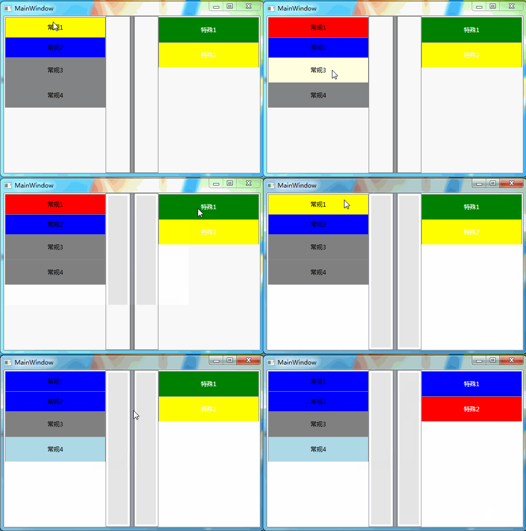
下图是测试结果图:其中常规1、2使用样式修改;常规3、4使用模板修改;特殊1、2为特殊方式处理。其中包含两个效果【MouseOver和Selected】


Windows Form中的TabControl重绘

旧地址:http://blog.canself.com/drawtabcontrol/

最近整理自己工作以来的旧项目,将其中的一些技术点整理出来。这个tabcontrol重绘相关的项目是自己毕业不久就做的一个,针对这个项目后面还有wpf版,暂且不提,暂时先看这个。

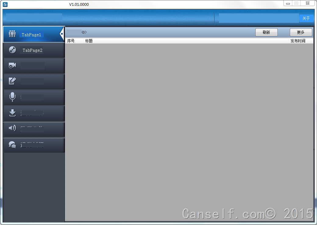
下面是软件的主界面,当然这个重绘的还不够完全,针对tabcontrol边框的处理还不好。

可以看出,也有一定效果的。😉

下面说说步骤,看看代码:

1、首先就是设置tabcontrol的drawmode属性,使其重绘有效。

1
this.tabc_draw.DrawMode = TabDrawMode.OwnerDrawFixed;

2、写tabcontrol的drawitem事件。

1
2
3
4
5
6
7
8
9
10
11
12
13
14
15
16
17
18
19
20
21
22
23
24
25
26
27
28
29
30
31
32
33
34
35
36
37
38
39
40
41
42
43
44
45
46
47
48
49
50
void tabc_draw_DrawItem(object sender, DrawItemEventArgs e)
{
Graphics g = e.Graphics;

TabPage changedpage = tabc_draw.TabPages[e.Index];//当前处理标签
Rectangle backrect = tabc_draw.GetTabRect(e.Index);//标签背景区域
Brush backbrush;//标签背景色
Brush fontbrush;//标签字体颜色
Font tabFont;//标签字体
Pen borderpen;//边框颜色

//TabControl绘制
Brush backtabcontrol = new SolidBrush(Color.Black);
g.FillRectangle(backtabcontrol, this.tabc_draw.ClientRectangle.X + 100, this.tabc_draw.ClientRectangle.Y, this.tabc_draw.ClientRectangle.Size.Width, this.tabc_draw.ItemSize.Height);
backtabcontrol.Dispose();

if (e.State == DrawItemState.Selected)
{
backbrush = new SolidBrush(Color.Black);
fontbrush = new SolidBrush(Color.Yellow);
tabFont = new Font("宋体", 15, FontStyle.Bold, GraphicsUnit.Pixel);
borderpen = new Pen(Color.LightBlue);
}
else
{
backbrush = new SolidBrush(Color.White);
fontbrush = new SolidBrush(Color.Red);
tabFont = new Font("楷体", 15, FontStyle.Bold, GraphicsUnit.Pixel);
borderpen = new Pen(Color.DarkGreen);
}
//绘制标签背景
g.FillRectangle(backbrush, backrect);

//绘制标签字体
StringFormat _StringFlags = new StringFormat();
_StringFlags.Alignment = StringAlignment.Center;
_StringFlags.LineAlignment = StringAlignment.Center;
g.DrawString(changedpage.Text, tabFont, fontbrush, backrect, new StringFormat(_StringFlags));
//绘制非标签原始名称【可依据e.State修改】 g.DrawString("呵呵", tabFont, fontbrush, backrect, new StringFormat(_StringFlags));

//绘制标签边框
//backrect.Offset(1, 1);
//backrect.Inflate(2, 2);
g.DrawRectangle(borderpen, backrect);

backbrush.Dispose();
tabFont.Dispose();
fontbrush.Dispose();
borderpen.Dispose();
}

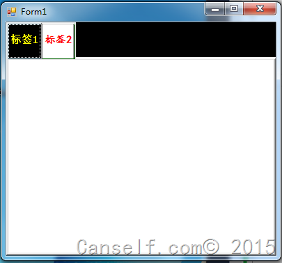
注释都在代码里了,就不详述了。下面是最后的效果的【只是简单的实现,自己多写写,模仿下就可以写出好效果啦】

修改outlook中ost文件位置

旧地址:http://blog.canself.com/modifyostpath/

outlook2013没法直接修改ost文件位置,故修改注册表以使outlook可以配置ost文件目录。

修改注册表内容如下:

1
2
3
位置:HKEY_CURRENT_USER\Software\Microsoft\Office\15.0\Outlook
键:ForcePSTPath
值:D:\DataFiles\EmailFiles

以下是bat文件,可以直接下载双击使用:下载地址1下载地址2

其他解决方案网址:

运用组策略修改Outlook 2013默认的ost数据文件位置

如何修改Outlook2013数据文件(.ost)位置的方法